|
|
Post by oliewood on Apr 15, 2008 21:44:35 GMT
 seriously not my best LOL i am a wizard on Paint pretty much, just thought id show you all and see what needs improvement! thanks  |
|
|
|
Post by Jake on Apr 16, 2008 10:17:49 GMT
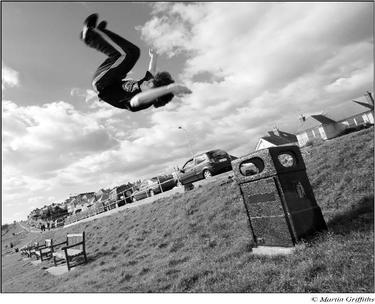
The angle that you took the photo from looks really cool, but i think that the man in the picture is a bit small compared to his environment. Maybe use a different type of font instead of just the one for every piece you produce.
|
|
|
|
Post by oliewood on Apr 16, 2008 15:05:12 GMT
thanks :]
origionally it was a precision but i edited out and stenciled a different picture on,
And i have to admit i use the font a lot LOL
I will change it later and put it back on :]
|
|
|
|
Post by Rob on Apr 17, 2008 16:31:53 GMT
typical cut out lettering  but does look quite cool would suit a skater being there more though |
|
|
|
Post by oliewood on Apr 17, 2008 19:57:10 GMT
yeah thanks for the info ive actually downloaded a nice new font to use next time. cheers ;D |
|
|
|
Post by Joe [street perfection] on Apr 18, 2008 12:35:40 GMT
no offense but i dont like the font.
just too pop art if you get me.
who is it in the picture
where is the picture taken
and which one of use otok it?
SAFE! HAHAH
|
|
|
|
Post by oliewood on Apr 18, 2008 15:06:00 GMT
haha yes joe we all know about the 'pop art' text now  and errrm i took the foreground in hythe when we were doing the stairset precision, and the small man is of be jumping off the skip LOL |
|
Antz Doust
Walker
 All movement dedicated to DPWDoust 1934 - 2002
Posts: 145
|
Post by Antz Doust on Apr 21, 2008 7:57:10 GMT
i agree with rob, i can just picture a skateboard underneath his feet
|
|
|
|
Post by oliewood on Apr 21, 2008 12:13:56 GMT
yeah thts cool ill put it up later, got a nice new text for the main 'street perfection' logo |
|


 and rob as hisdamn good
 ![Joe [street perfection] Avatar](http://i36.photobucket.com/albums/e44/joepepper/s4.jpg)